Shaping a brand
Evolving the Action for Children brand
One of my main responsibilities at Action for Children is to audit our brand to assure it reaches its full potential while differentiating us from other charities. When I first joined the charity I reviewed the creative assets as it was felt the brand wasn't reaching it's full potential.
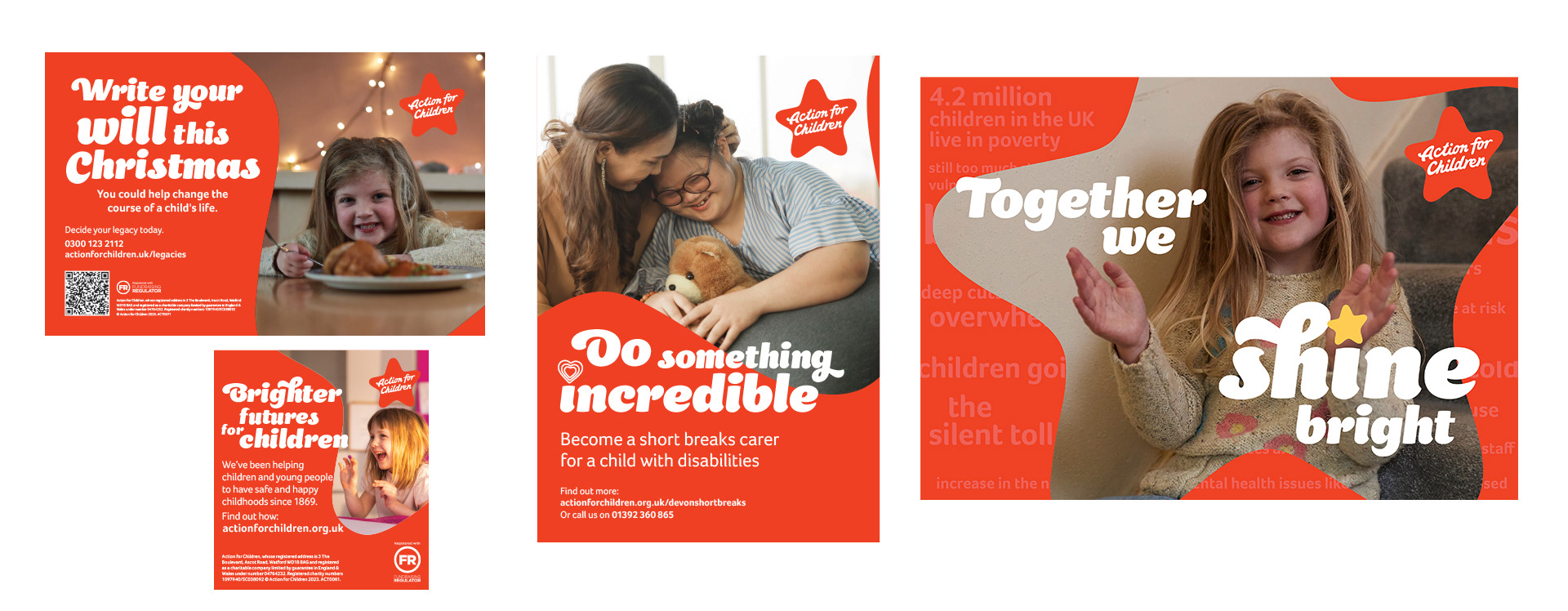
I concluded that the brand primary colour red was underutilized with the secondary colour palette often being favoured, giving the brand an inconsistent look and feel.
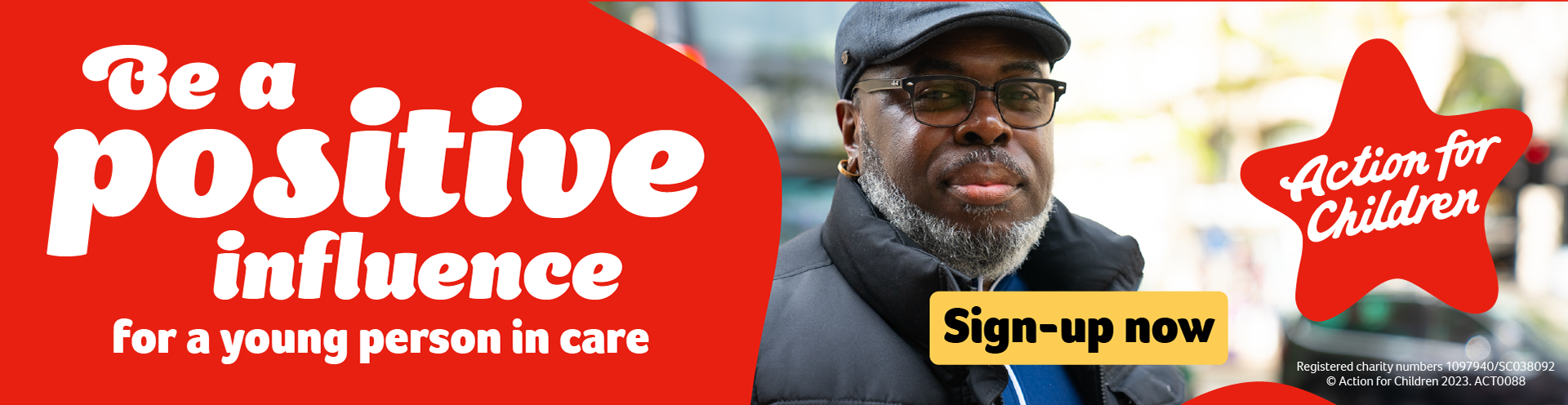
Moving forward I assured that our red was bought to the front giving our creative assets a consistent and stand out look. I also furthered this by creating the "star frame", a brand asset inspired by our logo, giving us a unique shape to frame and emphasise a headline or story moment while increasing the recognition of our uniquely star shaped logo.
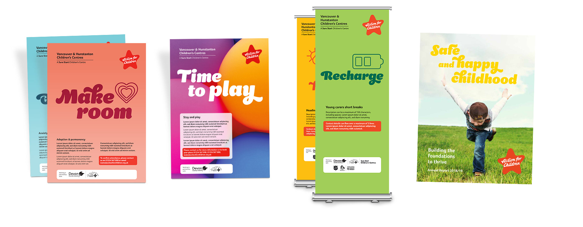
An example of the assets created before the audit
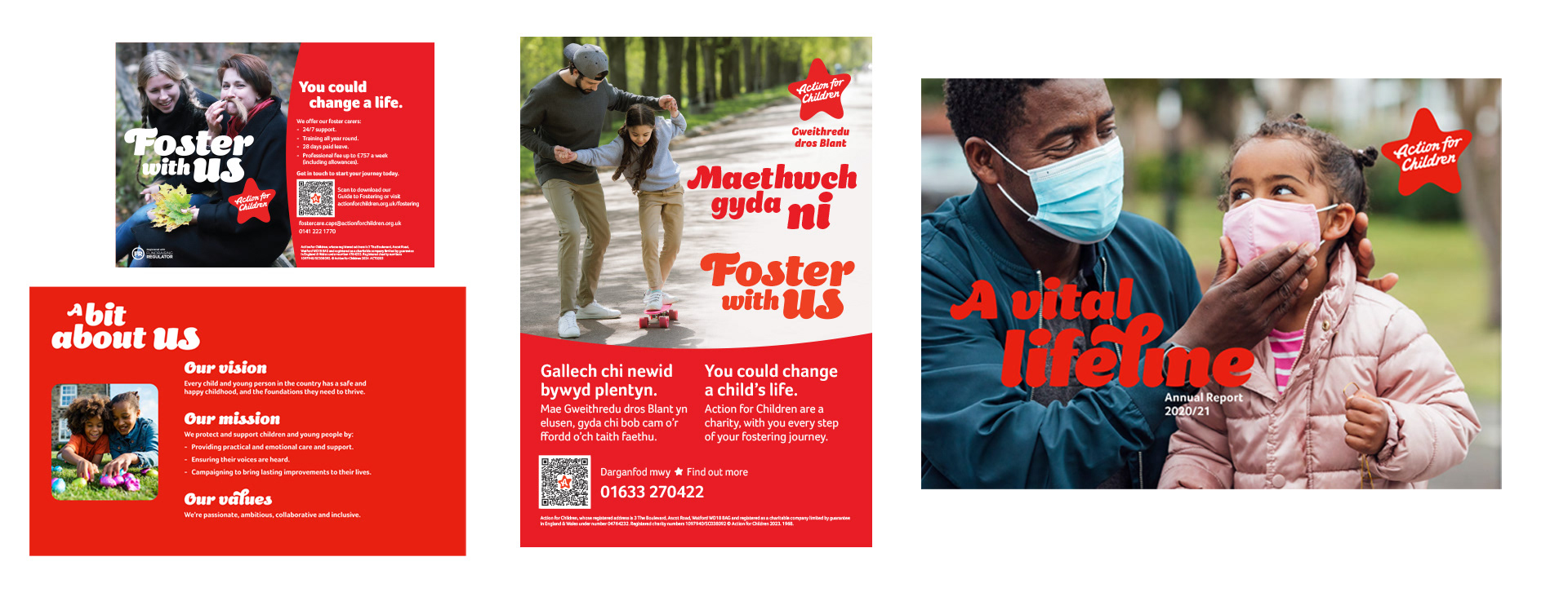
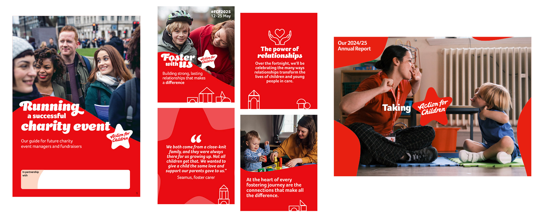
Using red as the predominant colour gave us a more distinct, consistent and recognisable feel
The star frame brand asset
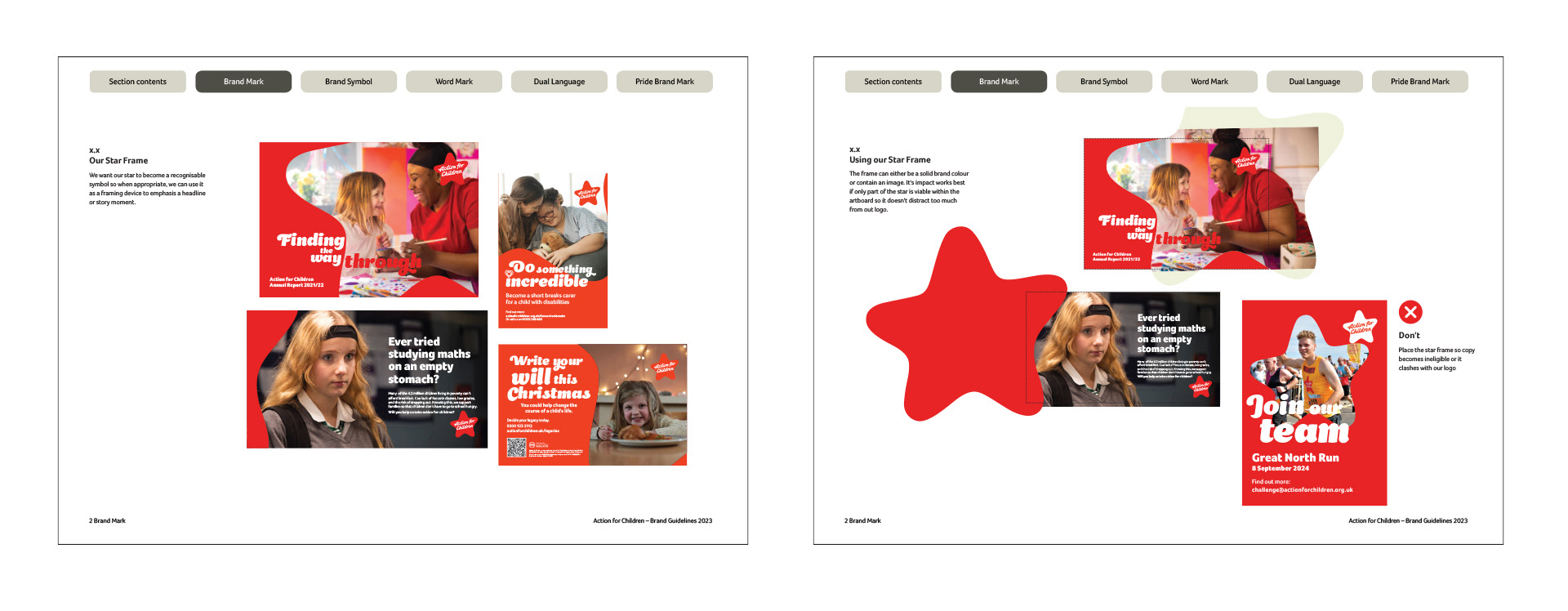
The brand guidelines were updated to reflect the new star frame
The charity has seen an increase of 45% prompted awareness amongst the UK public since the brand update